Working within an existing brand like Breathe Magazine required balancing creative expression with consistency. The challenge was to introduce refreshed layouts and visual elements without straying from the magazine’s calming, mindful tone.
I needed to maintain visual harmony, enhance readability, and use space intentionally, all while reinforcing the emotional quality of the content through typography, pacing, and illustration.
Challenges
Design Approach
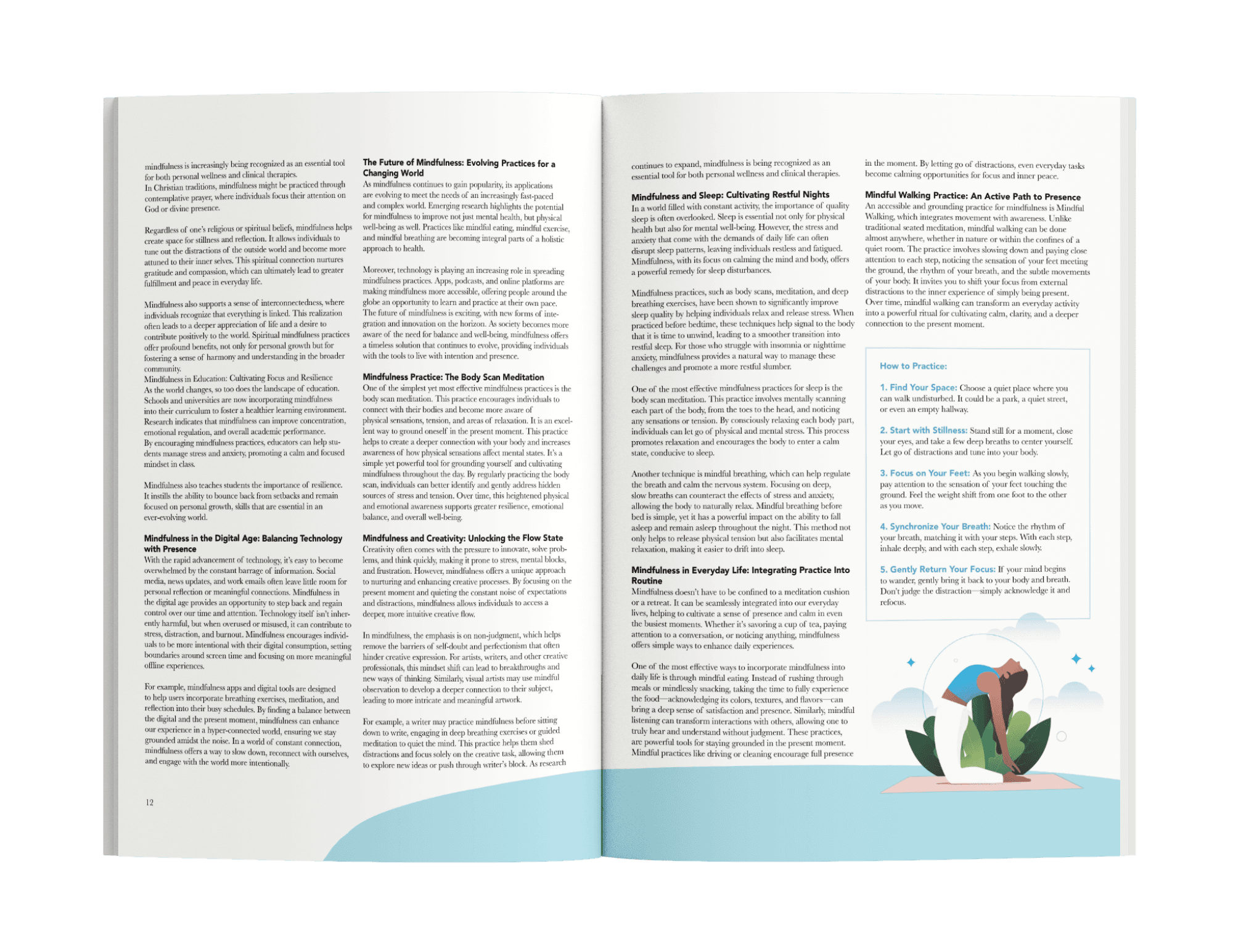
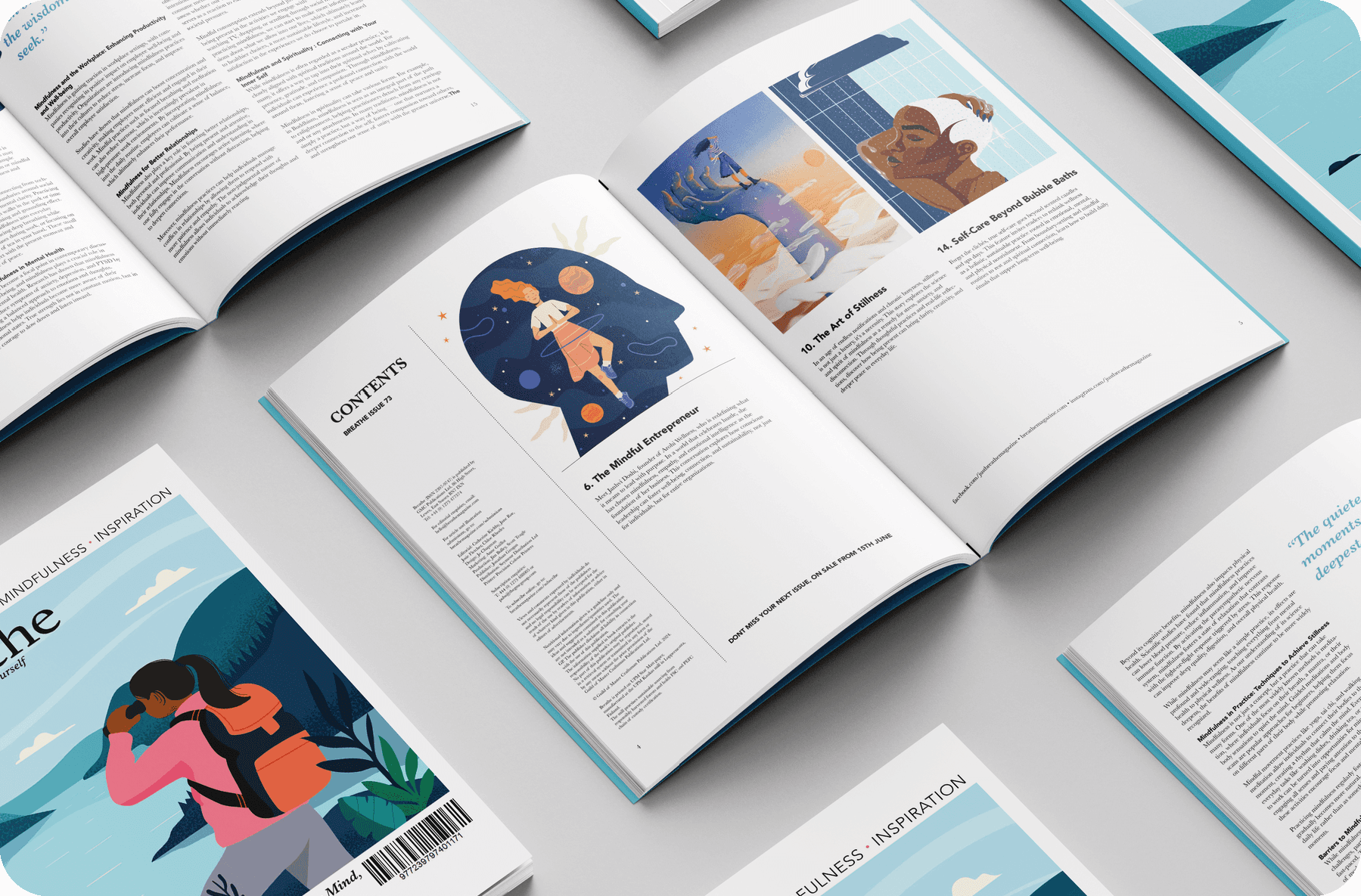
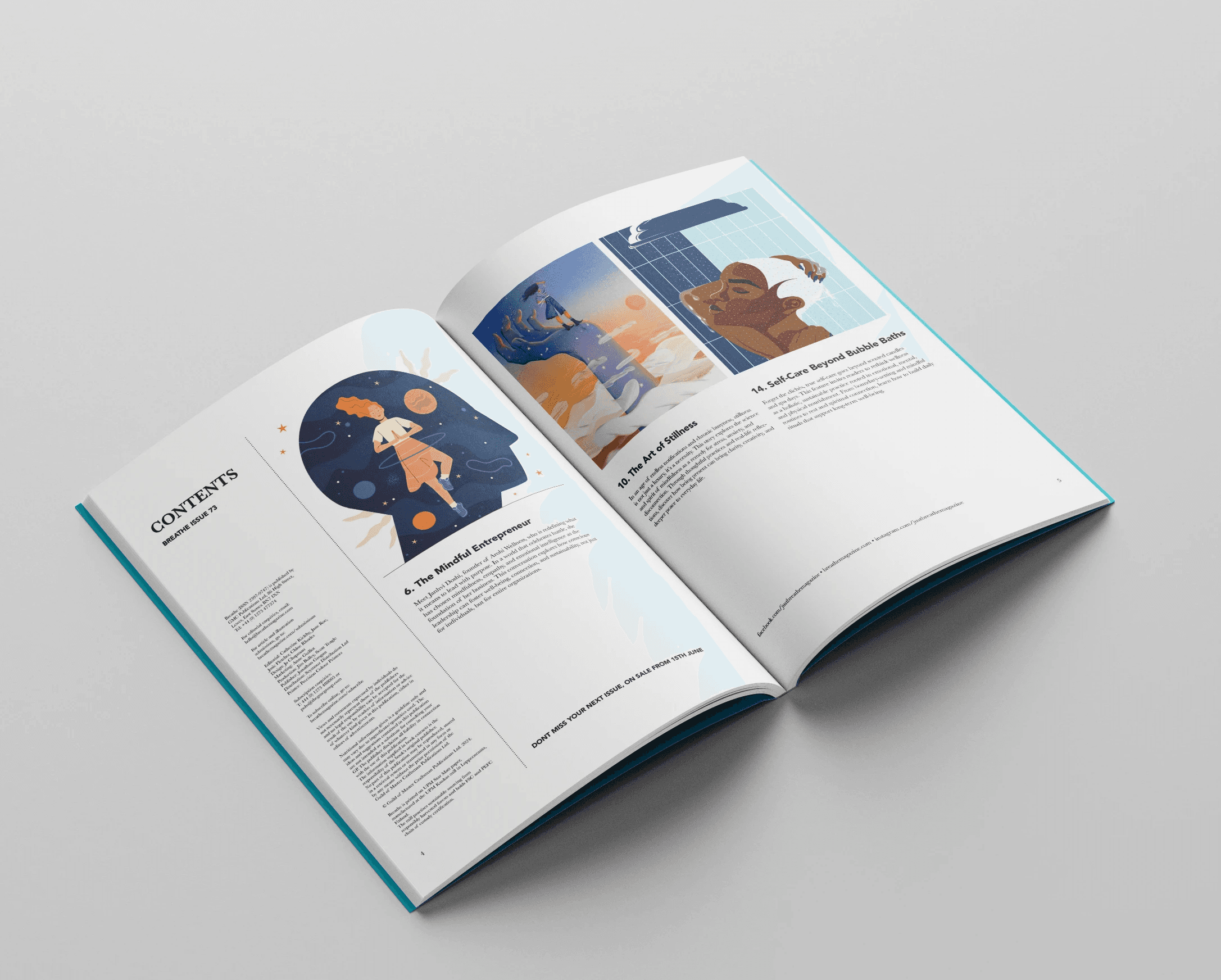
I focused on calm, intentional design choices to reflect Breathe’s focus on mindfulness and wellness. I used spacious layouts, soft color palettes, and clean typography to support a slower reading pace and visual ease.
The editorial grid allowed flexibility for features, quotes, and illustrations, while maintaining consistency across pages.
Overview
I imagined myself as part of the Breathe Magazine creative team, redesigning a feature issue to align with their mindful, nature-inspired brand. The goal was to refresh the magazine’s visual storytelling through calming layouts, clean typography, and soft, earthy tones — while staying true to its tone of self-care, intentionality, and wellness.
This speculative redesign explores how thoughtful editorial design can support content clarity, emotional tone, and brand consistency across print media.
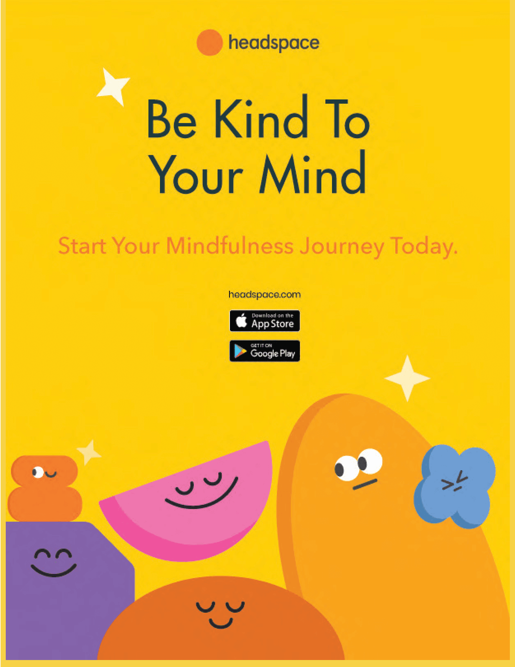
I designed a Headspace ad that fits seamlessly within Breathe Magazine, as both brands share a focus on mindfulness, emotional well-being, and intentional living. The concept aligns with the magazine’s purpose, making the ad feel like a natural extension of the editorial content.
Challenges
Working within an existing brand like Breathe Magazine required balancing creative expression with consistency. The challenge was to introduce refreshed layouts and visual elements without straying from the magazine’s calming, mindful tone.
I needed to maintain visual harmony, enhance readability, and use space intentionally, all while reinforcing the emotional quality of the content through typography, pacing, and illustration.

Design Approach
I focused on calm, intentional design choices to reflect Breathe’s focus on mindfulness and wellness. I used spacious layouts, soft color palettes, and clean typography to support a slower reading pace and visual ease.
The editorial grid allowed flexibility for features, quotes, and illustrations, while maintaining consistency across pages.


Design Approach
Working within an existing brand like Breathe Magazine required balancing creative expression with consistency. The challenge was to introduce refreshed layouts and visual elements without straying from the magazine’s calming, mindful tone.
I needed to maintain visual harmony, enhance readability, and use space intentionally, all while reinforcing the emotional quality of the content through typography, pacing, and illustration.
Challenges
Design Approach
I focused on calm, intentional design choices to reflect Breathe’s focus on mindfulness and wellness. I used spacious layouts, soft color palettes, and clean typography to support a slower reading pace and visual ease.
The editorial grid allowed flexibility for features, quotes, and illustrations, while maintaining consistency across pages.
Overview
I imagined myself as part of the Breathe Magazine creative team, redesigning a feature issue to align with their mindful, nature-inspired brand. The goal was to refresh the magazine’s visual storytelling through calming layouts, clean typography, and soft, earthy tones — while staying true to its tone of self-care, intentionality, and wellness.
This speculative redesign explores how thoughtful editorial design can support content clarity, emotional tone, and brand consistency across print media.
I designed a Headspace ad that fits seamlessly within Breathe Magazine, as both brands share a focus on mindfulness, emotional well-being, and intentional living. The concept aligns with the magazine’s purpose, making the ad feel like a natural extension of the editorial content.
Challenges
Working within an existing brand like Breathe Magazine required balancing creative expression with consistency. The challenge was to introduce refreshed layouts and visual elements without straying from the magazine’s calming, mindful tone.
I needed to maintain visual harmony, enhance readability, and use space intentionally, all while reinforcing the emotional quality of the content through typography, pacing, and illustration.
Design Approach
I focused on calm, intentional design choices to reflect Breathe’s focus on mindfulness and wellness. I used spacious layouts, soft color palettes, and clean typography to support a slower reading pace and visual ease.
The editorial grid allowed flexibility for features, quotes, and illustrations, while maintaining consistency across pages.
Design Approach