
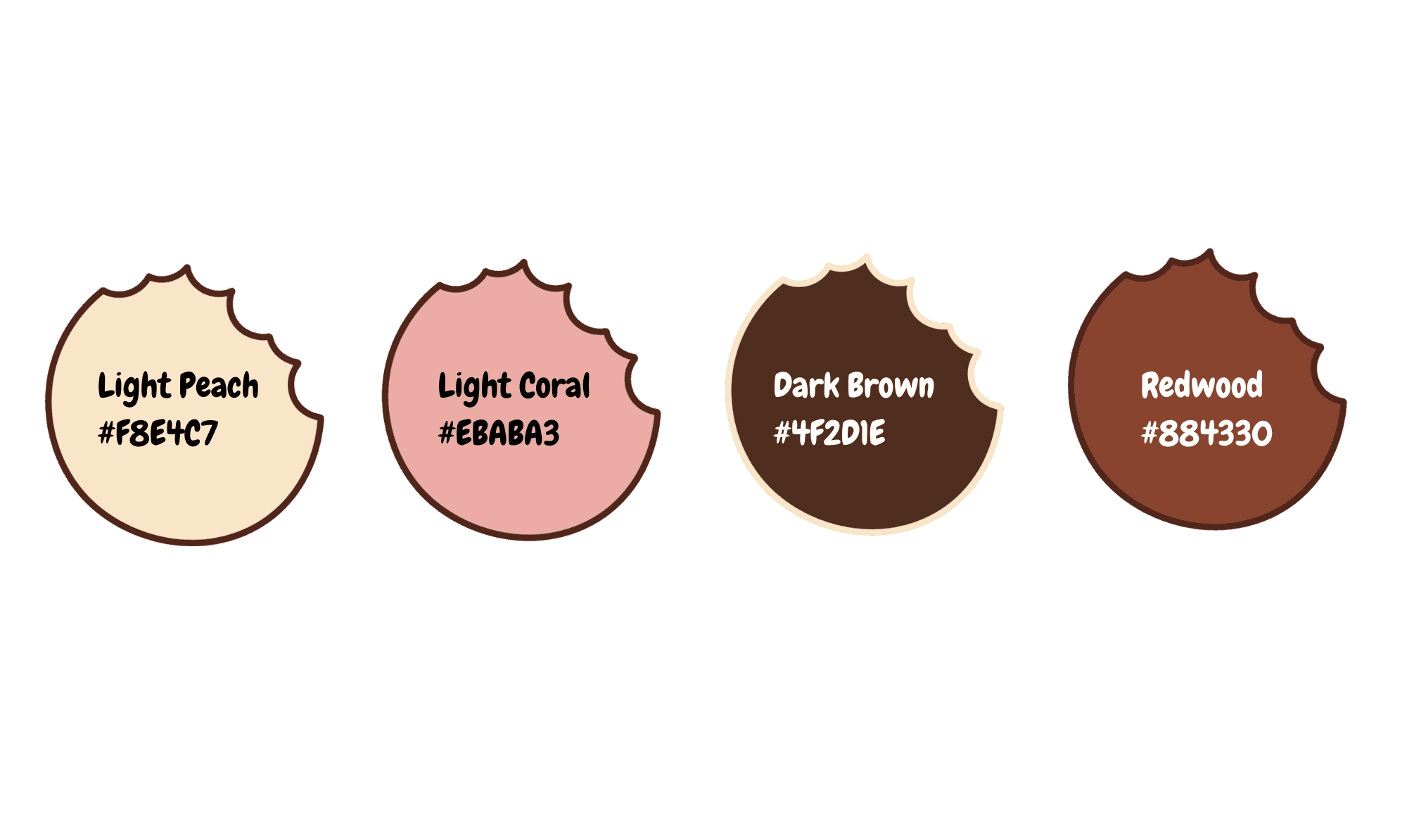
The color palette is a warm, dessert-inspired too. Together, these tones reflect the brand’s nostalgic yet modern feel, while enhancing contrast and readability across different media.
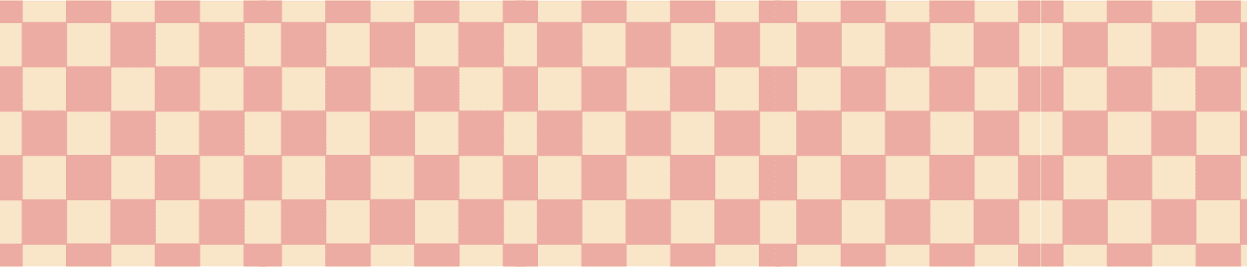
To support the brand’s sweet and quirky personality, I created a custom illustrated pattern featuring cookies, rolling pins, and whisks. The line-drawn style keeps the design light and playful, adding visual interest across packaging, signage, and digital assets.
Color Palette & Pattern


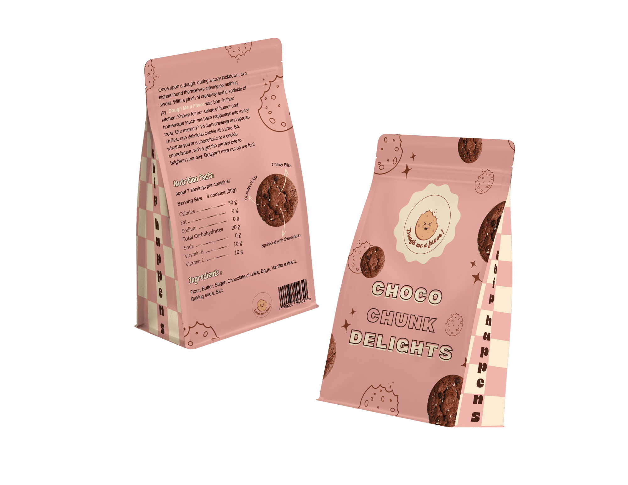


Event Design & Print Collateral
The brand was brought to life through a cohesive event and packaging system designed for a pop-up activation. This included a cookie guessing challenge booth, pastel-toned packaging, and playful roll-up posters that reflected the brand’s cheerful tone. The full experience blended strategic design with visual charm to deliver an engaging, multi-touchpoint launch.
The Challenge
The main challenge was to design a brand identity that felt both unique and instantly likable, while staying true to the familiar charm expected from a bakery. It needed to be approachable, visually cohesive, and marketable across multiple touchpoints like packaging and promotions.
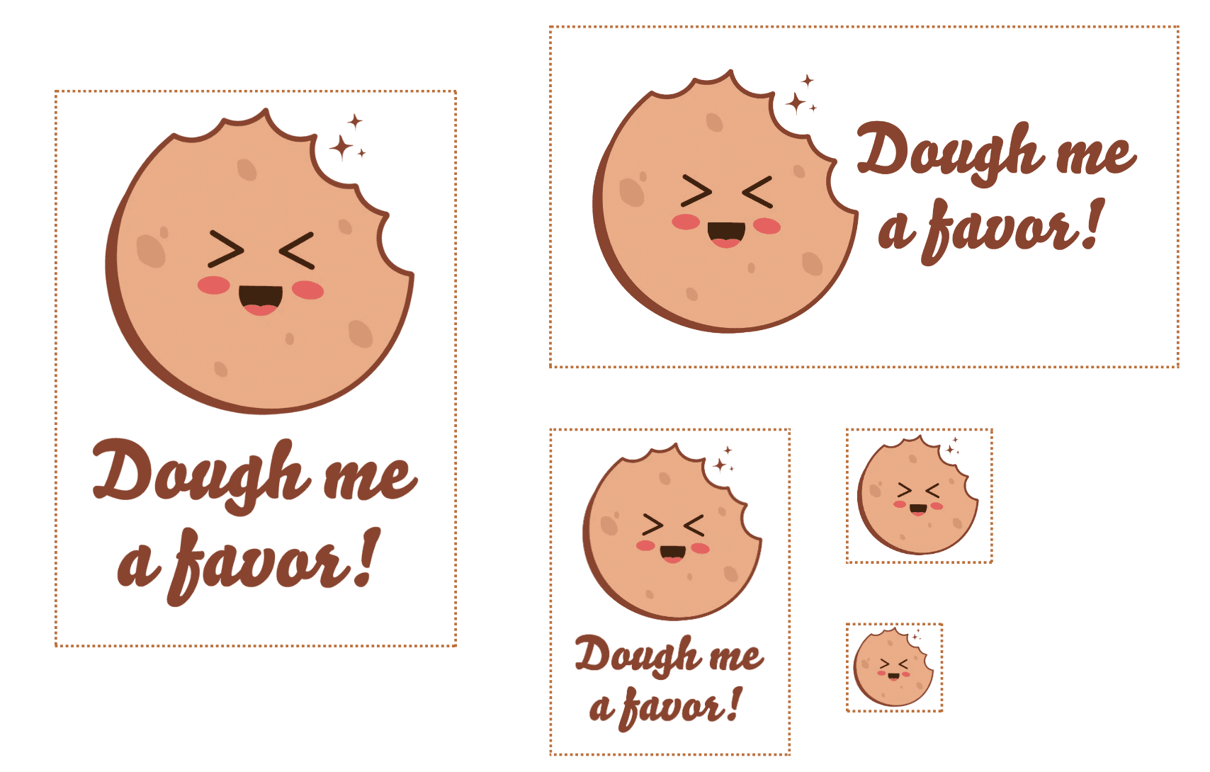
To build brand awareness and spark curiosity, a playful social media campaign was developed featuring CTA-driven content that encouraged user interaction and product trial.
Social Media Campaign
The Challenge
The main challenge was to design a brand identity that felt both unique and instantly likable, while staying true to the familiar charm expected from a bakery. It needed to be approachable, visually cohesive, and marketable across multiple touchpoints like packaging and promotions.
Overview
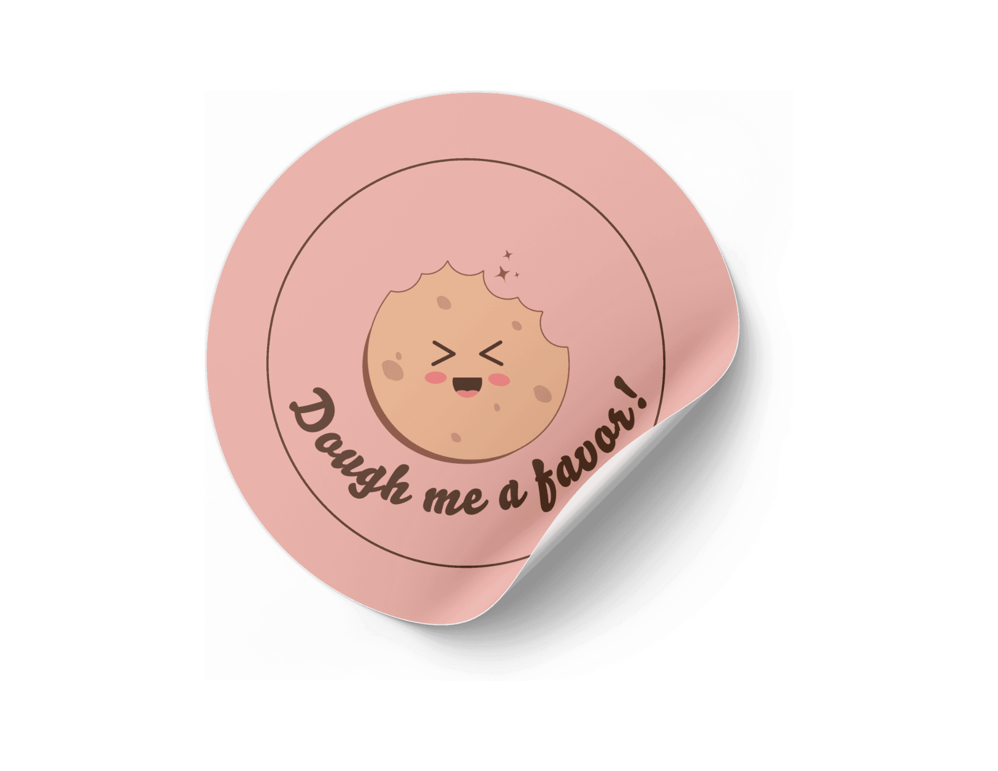
Dough Me a Favor is a whimsical cookie brand I developed for a branding and marketing project. Aimed at young adults and families who love sweet treats and bold visuals, the brand blends playful design with strategic thinking to bring a small bakery concept to life across multiple platforms.
The project includes a cohesive visual identity and an integrated campaign spanning packaging, social media, event booth graphics, print materials, and a responsive website mockup. Designed to feel lighthearted, nostalgic, and modern, the brand uses a pastel color palette, soft curves, and a cheeky tone of voice to deliver charm and consistency at every touchpoint.


Social Media Campaign
The color palette is a warm, dessert-inspired too. Together, these tones reflect the brand’s nostalgic yet modern feel, while enhancing contrast and readability across different media.
To support the brand’s sweet and quirky personality, I created a custom illustrated pattern featuring cookies, rolling pins, and whisks. The line-drawn style keeps the design light and playful, adding visual interest across packaging, signage, and digital assets.
Color Palette & Pattern
Event Design & Print Collateral
The brand was brought to life through a cohesive event and packaging system designed for a pop-up activation. This included a cookie guessing challenge booth, pastel-toned packaging, and playful roll-up posters that reflected the brand’s cheerful tone. The full experience blended strategic design with visual charm to deliver an engaging, multi-touchpoint launch.
The Challenge
The main challenge was to design a brand identity that felt both unique and instantly likable, while staying true to the familiar charm expected from a bakery. It needed to be approachable, visually cohesive, and marketable across multiple touchpoints like packaging and promotions.
To build brand awareness and spark curiosity, a playful social media campaign was developed featuring CTA-driven content that encouraged user interaction and product trial.
Social Media Campaign
The Challenge
The main challenge was to design a brand identity that felt both unique and instantly likable, while staying true to the familiar charm expected from a bakery. It needed to be approachable, visually cohesive, and marketable across multiple touchpoints like packaging and promotions.
Overview
Dough Me a Favor is a whimsical cookie brand I developed for a branding and marketing project. Aimed at young adults and families who love sweet treats and bold visuals, the brand blends playful design with strategic thinking to bring a small bakery concept to life across multiple platforms.
The project includes a cohesive visual identity and an integrated campaign spanning packaging, social media, event booth graphics, print materials, and a responsive website mockup. Designed to feel lighthearted, nostalgic, and modern, the brand uses a pastel color palette, soft curves, and a cheeky tone of voice to deliver charm and consistency at every touchpoint.
Social Media Campaign